Opening slide: the carousel cover decides everything, and it is seen twice

By Tiago Costa·Updated on August 5, 2026

Definition
The opening slide is the carousel cover deciding whether anyone swipes.
- Highest leverage element of the whole piece.
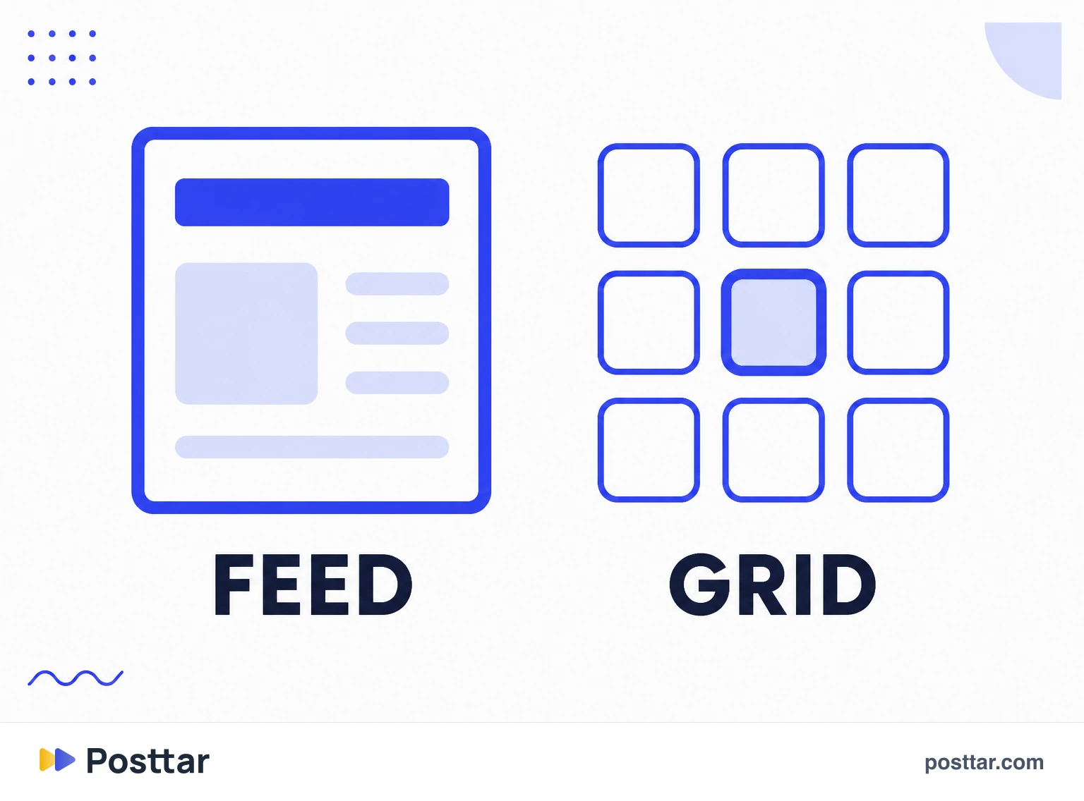
- It appears in two contexts: full feed and grid thumbnail.
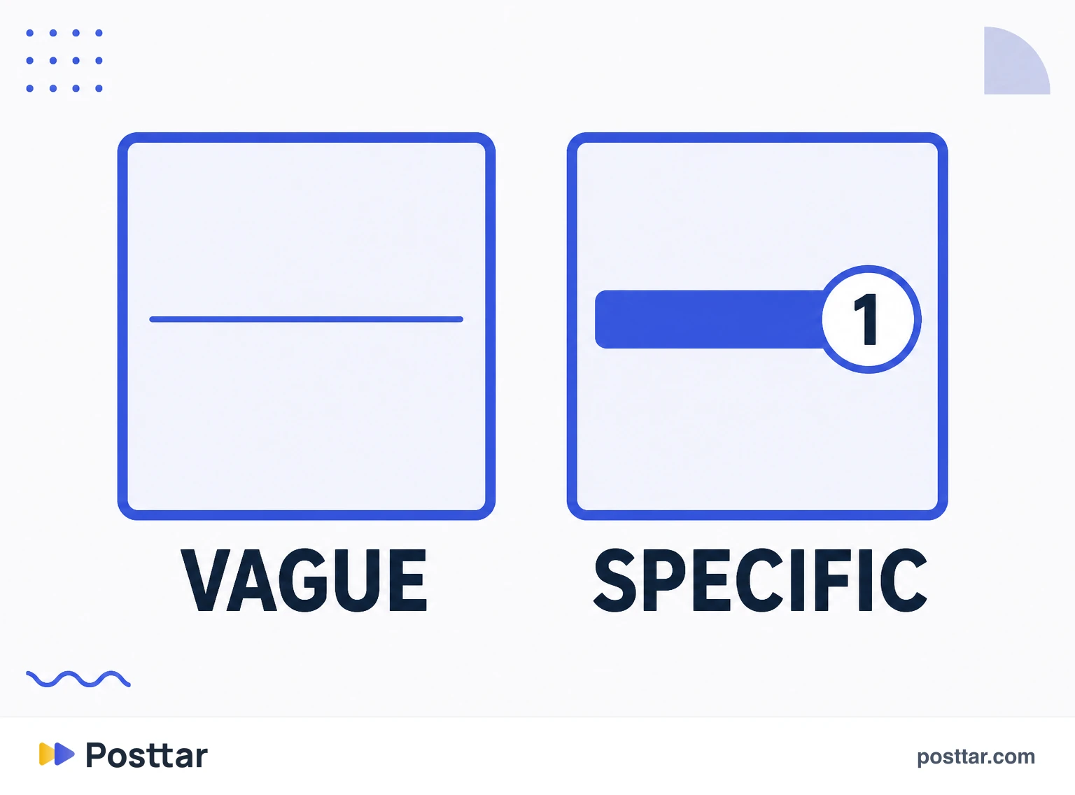
- A specific promise beats a vague title every time.
- Legible when small, or it disappears in the profile grid.
The two contexts
This is the particularity that changes the design and almost nobody considers.
In the feed, the cover appears large, and that is where it has to stop the thumb and promise enough for the first swipe.
In the profile grid, the same image appears tiny, next to dozens of others. There it has to be recognisable and legible at a few centimetres.
The practical consequence: small text kills a cover in the grid. A three line title that works in the feed becomes a grey smudge on the profile, and the profile is where someone decides to follow.
The ruler that solves it: shrink the cover to thumbnail size and check whether the main idea is still readable.
What to write
The cover is a visual headline, and the same rule applies: specific beats vague.
- Promise something concrete. "5 bio mistakes that make visitors leave" beats "profile tips".
- Use a number when there is one. Numbers communicate scope and lower the perceived cost of swiping.
- Name the audience. When the carousel is for a segment, saying so on the cover raises relevance for the people who matter.
- Create tension, not mystery. Curiosity the content delivers works; a riddle with no answer burns trust.
A short sentence set large usually returns more than a complete sentence set small. If it does not fit large, the text is too long.
Design that works
- High contrast. Light text on dark background or the reverse. Text over an untreated photo is the most common mistake and the easiest to fix with a dark layer underneath.
- One idea per cover. Two competing messages split attention and neither wins.
- Visual consistency. If all your covers share colour and typography, the profile becomes recognisable from a distance.
- Margin around the text. Text glued to the edge looks amateur and is sometimes cropped depending on where it is displayed.
Mistakes that kill reach
- A beautiful, empty cover. Elegant design with no promise makes nobody swipe.
- A generic title. "You need to know this" does not say what it is, and the cost of swiping blind is too high.
- Text that runs too long. If it needs careful reading, the person already scrolled past.
- "Swipe" as the main message. An instruction is not a reason. What drives the swipe is the promise, not the request.
- Leaving the cover for last. Building ten slides and improvising the cover at the end is the wrong order: the cover decides whether the rest gets seen.
Checklist
- The main idea is legible as a thumbnail.
- The promise is specific rather than generic.
- There is only one idea on the cover.
- Contrast is high enough.
- I wrote the cover before building the rest.
Frequently asked questions
What is the opening slide of a carousel?
It is the first frame, the cover appearing in the feed. It is the highest leverage element of the whole piece: if it does not stop the thumb, the following slides never get seen.
What should the first slide of a carousel say?
A concrete promise, short and set large. Prefer a number and a specific detail to a vague title, and name the audience when the content targets a segment. A short sentence set large returns more than a complete sentence set small.
Why does my cover disappear in the profile grid?
Because small text does not survive the thumbnail. The cover appears in two contexts, large in the feed and tiny in the grid, and the second is where someone decides to follow. Shrink it to thumbnail size and check it still reads.
Should I write "swipe" on the cover?
Not as the main message. An instruction is not a reason: what makes someone swipe is the promise of the content, not the request. As a small secondary element it can help people unfamiliar with the format, but it does not replace the hook.
Should the cover be made before or after the other slides?
Before. Building ten slides and improvising the cover at the end is the wrong order, because the cover decides whether the rest gets seen. Defining the promise first also clarifies what each slide has to deliver.
Related concepts

Carousel
A carousel is the Instagram post that holds up to 20 images or videos in a single publication, navigated by swiping sideways. It occupies the same feed space as a regular post but asks the viewer for one extra action, and that action is what makes it valuable: every frame advance adds dwell time, and the format gets a second delivery chance, because Instagram can re-show the post starting from a different frame to people who did not interact the first time.
Read the entry
Turning slide
The turning slide is the middle frame of a carousel that renews interest before someone gives up. Every carousel has an abandonment curve, and it falls hardest between the third and fifth frame, once the cover's novelty is gone and the end is still far away. The turning slide exists to place something unexpected at exactly that point.
Read the entry
CTA slide
The CTA slide is the last frame of a carousel, where the call to action goes. It carries a structural problem almost nobody faces: it is the least seen frame of the whole sequence, because only people who swiped all the way reach it. That changes what makes sense to put on it, and explains why carousels stacking five requests at the end do not convert.
Read the entry
Headline
A headline is the opening line that decides whether the rest of the content gets consumed. It is the highest leverage element of any piece: if it fails, everything after it stops existing, however good it is. On Instagram it appears in three different places, and each carries a constraint of its own that changes how it should be written.
Read the entry